
Harmonee
A hackathon project aimed to provide immediate support for victims of domestic violence under the guise of a music identification app
Trigger Warning:
Domestic Violence
Overview
Team: 5 person team
Role: Scrum Master
Duration: 2 day sprint
Tools: Figma, Google Suites, Asana
Methods: Competitive/comparative analysis | User flow | Design studio | Lo-fi sketching | Mid-fi wireframing | Prototyping | Hi-fi prototyping | User testing
Index: Introduction | Scheduling | The Problem | Research | The Solution | User Flow | The Design | The Prototype | User Testing | Reflection
Introduction
This was a five person team hackathon in which I was responsible for facilitating communication between the research and design teams, leading meetings, supporting each team in their respective tasks, and scheduling tasks in Asana.
I worked with both the design and research teams in creating sketches, user flows wireframes, and prototypes.
The hackathon prompt was for us to create an app or website that addresses an aspect of a social issue. Our team decided to tackle the issue of domestic violence by building an app that offers immediate support to victims of domestic violence under the guise of a music identification app.
Scheduling
Our team was given two and a half days to complete this project with multiple rounds of user testing. It was very important to me that we not work, unless absolutely necessary, outside of designated work hours. Due to the short time span, I wrote the following schedule so that we could complete the hi-fi prototype after two rounds of user testing.


The Problem
According to CDC’s National Intimate Partner and Sexual Violence Survey, about 1 in 5 women and 1 in 7 men report having experienced severe physical violence from an intimate partner in their lifetime. This number is staggering, particularly considering the number of cases that go unreported, and that are ongoing today. The people experiencing this abuse may find it difficult to call for help, as they may not feel believed, or they may fear for their lives if they are found doing so.
Victims of domestic violence need a discreet way to call for help and record evidence without getting caught by their abuser.
Research
Due to the two day time constraint as well as concerns centered around privacy due to the sensitive nature of the topic we chose, I decided to forego discovery interviews. I also felt that rather than create an app for a particular persona, it would be more effective for us to keep in mind that we must create an app that is inclusive of every person, as domestic violence is a real issue that affects all populations. Therefore, our team moved toward a design with a focus on inclusivity.
In order to find the features missing in existing mobile applications, our research team conducted a competitive analysis across five different apps: Noonlight, Rev Voice Recorder, TapeACall, DocuSAFE, and Aspire News App.

What we found was that not all the applications had features like location finding and the ability to call for immediate help, which are essential for people in potentially dangerous situations.
The Solution
In order to address our problem, as well as fill in gaps that other applications may lack, we came up with a list of requirements for our app.
We wanted to provide support for the abused that is:
Easily accessible
Available in different languages
Disguisable as a common app that people would have on their phones
In order to be useful in times of need or in collecting evidence, the app would also need the following:
An easy record feature
A way to alert dispatch in the case of emergency
A way to communicate a level of urgency
User Flow


In order to gain a more thorough understanding of what our application would entail step-by-step, I created a user flow, first starting with the onboarding process. Accessibility for all people experiencing domestic violence was a huge focus for our application, so I wanted to make sure that users could select their language preferences before moving on to any other part of onboarding.
Next, I created the user flow for a user moving through the application during an event that would require them to record and either save the recording, or send the recording to a team of social workers who, depending on the level of urgency as dictated by the user, would either make record of the instance or contact dispatch. This user flow would then inform the tutorial portion of our application.
The Design
Sketches


Finally, we came to the idea of a music identification disguise where users could easily record their surroundings, but the app would appear as if it is looking for music to identify.
Our initial sketches were made with the disguise of a pizza delivery app in mind, but we realized it was not culturally inclusive, as not everyone eats pizza.
Next, we thought of ways to build this app to look like a food delivery app, but when reviewing our competitive/comparative analysis, we realized that we could not incorporate an easily disguisable but quickly accessible record feature that other apps were missing.
The Prototype
Mid-Fi Version 1
Onboarding
Before users have access to the main functions of the app, they go through an onboarding process by selecting language and location preferences and where they would like recordings to be saved.

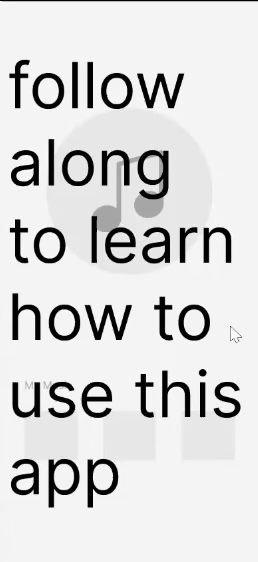
Tutorial
Because this app is disguised as a song identification app, its actual functions would be hidden. In order to learn how to access these functions, users will go through a step-by-step tutorial guiding them in how to start and save recordings, send recordings to a team of social workers, and access recordings.
User Testing
Round 1
We conducted a usability test with 8 participants and asked them to complete the following three tasks:
Select a language and create an account
Complete the tutorial
Send a recording to a social worker

The first two tasks saw a 100% success rate, whereas our users had difficulty completing the third task. Our heatmap shows that users were clicking on the X button above the error message rather than the error message itself in order to send the recording out. We decided to clarify our directions in the tutorial and test for this task on our second round of user testing to see if there would be a significant improvement.
“The third task was a little confusing.”
The Prototype
Mid-Fi Version 2

For this iteration, I decided to specify what to click on in the tutorial, as well as showed an arrow pointing to correct area. Hopefully, this would lead to a higher rate of success in user testing and clarify the task for users.
We also decided to introduce the feature of swiping left and right to change the colors of the background of the app. The tutorial would include an explanation of the significance of each color background.
User Testing
Round 2
For our second round of user testing, we had 12 users participate in completing 3 tasks and received the following results:
Complete the tutorial and send a recording to a social worker.
54 seconds
100% success
Slide to the green background and save a recording.
27 seconds
100% success
Slide to the red background and send the recording to a social worker.
27 seconds
50% success
While the first 2 tasks had 100% success, the last task was difficult to complete with a success rate of 50%.
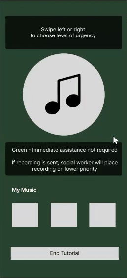
After analyzing these results, we realized that our app could benefit from incorporating the directions for the color changes in the beginning of the tutorial, and creating more cohesion between the tutorial and the main application.
As a result, we decided to make the following image the first page of our tutorial:

“I get the premise of the app, however intuitively without some instruction or prompt, I’d have no idea how to operate each screen”
The Prototype
Hi-Fi


Onboarding
This is the updated onboarding process. Users who neglect to select certain preferences will now receive an error message asking them to select them before continuing, and assures users that they will be able to change these preferences in the future if they wish to do so.
Tutorial
A major update for this round was in our tutorial, which is extremely important for the user to understand because it allows them to effectively use our application. Here we begin with an explanation of the colors, and allow the user to practice swiping through the different colors which will represent the level of urgency to be communicated to our team of social workers.
Main Application
This is the main application which users will be brought to after they complete the tutorial and onboarding. As an improvement from the previous iteration, there is now cohesion between the tutorial and the main application.
Reflection
Working on Harmonee was an incredibly fulfilling experience, as myself and my team all believed that this app would empower victims of domestic violence. Given the time limitations of this project, there were many steps that we would like to take in the future to further improve Harmonee.
Must Do:
Conduct more user testing, particularly to test our newly updated tutorial
Make our tutorial more concise and easy to remember
Should Do:
Create a way for users to access the tutorial again if they ever want to review it at any point
Could Do:
Add a feature through which our users can communicate with social workers
Provide a section with information regarding other resources for survivors of domestic violence
A key takeaway is that research is essential in building an app that is easy to understand. I am grateful to have been given this opportunity to work on something that I truly believe would help make a better tomorrow.