
A speculative industry-specific and messaging feature for the desktop and mobile LinkedIn site. Designed to make connecting with other industry professionals easier to begin and track.
Overview
Team: 4 people, 2 on research and 2 on design
Role: UX Designer
Duration: 2 week sprint
Tools: Figma, Slack, Google Suites, Asana, Zoom, Miro
Methods: Interviews | Affinity mapping | Persona development | User journey | Site mapping | Competitive/comparative analysis | Heuristic evaluation | Design studio | Lo-fi sketching | Mid-fi wireframing | Prototyping | Hi-fi prototyping | User testing
Index: Introduction | Research | Design | User Testing | Iteration | Reflection and Next Steps
*Methods in bold are the ones I specifically took part in for this project
Introduction
This is a four person team project in which I was responsible, alongside one other person, to create the sketches, wireframes, and prototypes. I will briefly go over the research that my teammates conducted in order to provide context for which the design was made as well as show the parts of the prototype that I was responsible for.
Research
Our team was tasked with improving the current LinkedIn site in three ways:
Users will have an easier way of knowing who in their network to contact in order to progress within their industry of interest
Users will have an easier way of knowing when to contact valuable connections
Users will be able to track the effectiveness of their outreach
The main problem that we were to tackle was that users would often network outside of LinkedIn. By addressing the above improvements, we hoped that more networking would occur within LinkedIn, thereby increasing engagement and usage.
Competitive Analysis
In order to pinpoint gaps in the features that LinkedIn offers, my partner and I conducted a competitive/comparative analysis between LinkedIn and 5 of its competitors and comparators.

Through this analysis, we found that LinkedIn was missing a way for users to track the efficacy of their outreach and create groups of multiple people that they could message at once. We decided to tackle these gaps by adding these features in our prototype.
Discovery Interviews
In order to better understand the way our user needs and frustrations, our research team conducted 6 interviews with current LinkedIn users with the following key characteristics:
24-30 years old
Entry level/transitioning careers
Use LinkedIn at least once per week

Our research team was able to organize the data from interviews into these key points:
Users value connections in their industry
Users value connections who work at companies where they want to work
Users do not currently have a system for organizing messages
Users currently have to scroll through recent messages to keep track of conversations
Persona
Using the key insights from our 6 interviews, our research team was able to create our persona, Ashley.

Like other LinkedIn users, Ashley shares the following wants and frustrations:
Wants to connect with others in her industry
Wants to leverage her current connections
Is annoyed that she has no way to organize her messages
The Problem
As a team, we were able to create the following problem statement to encompass Ashley’s needs and figure out how we might be able to improve her experience on LinkedIn:
Ashley needs a way to efficiently network with people in her industry as well as utilize the connections she already has.
Solutions
Knowing Ashley’s needs and frustrations, we were able to craft the following solutions:
Provide Ashley with recommendations for who to connect with based on her industry of interest and mutual connections
Provide recommendations for how to connect with others and what to write in messages
Provide a feature for Ashley to mark interactions as successful or ongoing
Design
Sketches

My partner created the sketch above, which I used to create the filtering option for the desktop version of our site. Here, the filters are to the right of the search bar rather than on the left sidebar. Another feature in this sketch is that the filters in use are shown underneath the search bar, so that users can easily be reminded of what their results are filtered by, and can easily delete the filters they are no longer interested in using.
The sketch above is mine, showing the filtering options to the left sidebar. I was influenced by the filtering features often found on e-commerce sites selling clothing. However, we chose not to go with this idea, as it would not be feasible for our mobile version. We wanted to make sure our desktop and mobile sites were as similar as possible, so users familiar with one over the other could easily make the transition.
Mid-Fi Wireframes
Using these sketches as reference, my partner and I then split duties and worked on mid-fi wireframes to bring the sketches to life. My partner took on the messaging features, while I took on the networking feature.

This is the mid-fi wireframe for our home page of the desktop site. It very closely resembles the current LinkedIn homepage.

Here, on the My Network page, we can see that there is the added filtering function next to the search bar.

This is the mobile version of our homepage and My Network page. The filtering function is similarly next to the search bar, and existing filters appear underneath the bar, where users can easily view them and delete them if they no longer wish to use them.
Prototypes
Using our mid-fi wireframes, my partner and I then moved on to create the prototypes for our features. The following are the prototypes that I built, as my partner was responsible for the messaging feature.
-

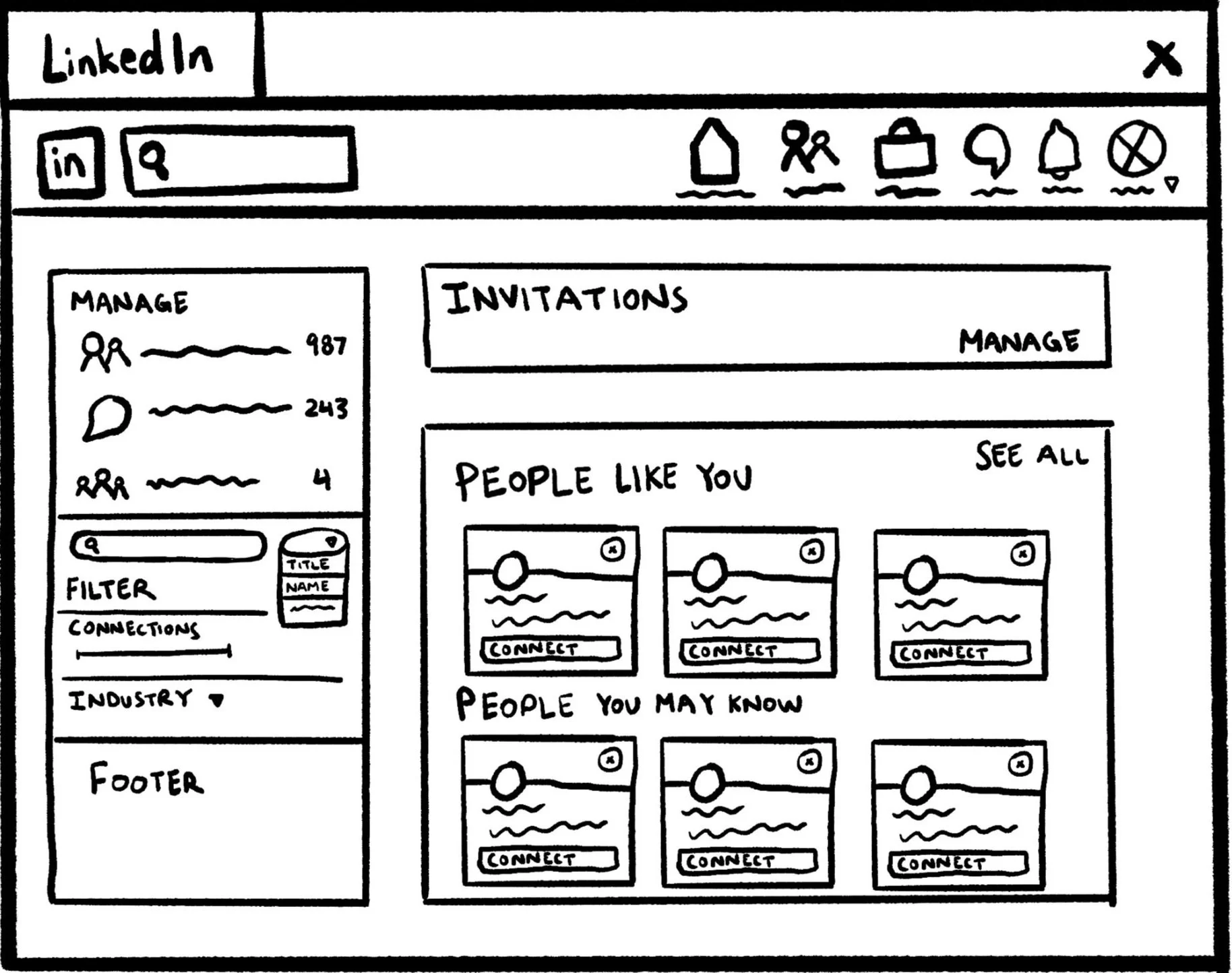
My Network
Users can access the My Network page from the Homepage and view their recommended connections, as well as filter for new or existing connections.
-

Filtering
Users can open the Filter option and filter for industry, recruiters, and number of connections. We added these options because our users stated that the number of connections another user has often will lend them a sense of credibility. Users also stated that they would like to use LinkedIn to connect with other people in their interested industries, particularly recruiters.
-

My Network
Users can access My Network on the bottom navigation bar of the mobile site. I chose to have this navigation bar on the bottom so that users can easily access different pages using their thumb.
-
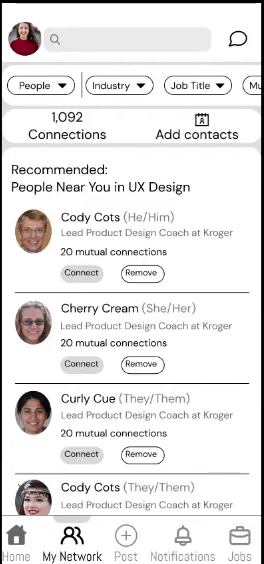
Filtering
Users can then filter for connections in the different industries they showed interest in, as well as for recruiters. Recruiters are easily spotted by the badge next to their names.
User Testing
Our research team conducted user testing on our mid-fi prototypes with 4 participants on the mid-fi mobile prototype and 5 participants on the desktop prototype. These participants were all users familiar with the LinkedIn mobile and desktop sites, and were located in different regions of the United States. These are some of our research team’s findings:
The average for users to complete one task on the mobile website was 10 seconds and 3 clicks
The average for users to complete one task on the desktop site was 7.5 seconds and 2 clicks
Users experienced challenges in the first task, which was to filter for connections in the gaming industry
Users first tried clicking on “My Connections” at the left sidebar rather than the filtering button to the right of the search bar
Iteration
Because of the problems our users had with using the filtering button to the right of the search bar, I decided to create the “My Industry” tab accessible on the left sidebar. This would then allow users to filter for Type, Job Title, and so on so forth for connections working within their own industry.
-

My Industry
After users access My Industry to the left, they are able to filter for other users within their industry by their job title and other descriptors. I made sure that these filters were similar to those on the mobile site so that users could easily transition from one to the other.
Next Steps and Reflections
I am very grateful to have an incredible team of talented UX Designers and Researchers to work with and learn from. There are some things we could do as next steps to further improve LinkedIn if I were to be given the wonderful opportunity to continue working with them. They are as following:
Must Do:
Conduct further user testing, particularly on the newly added “My Industry” tab and use data to improve the feature with more iterations
Should Do:
Add a note-taking feature to our messaging page so that users can take notes of advice or of their progress next to each of their messages, which will allow them to search for messages more easily and record important thoughts
Could Do:
Add a verification process for recruiters. While we added a recruiter badge, we did not build out a verification process for recruiters to get this badge as it was not relevant to Ashley’s needs, but we can add that process in the future
To reflect, I thoroughly enjoyed working with a team and look forward to more opportunities to collaborate with others in my future. I also enjoyed the challenge of having to find new solutions after user testing revealed the challenges our users had with our initial design. I am grateful for the chance to exercise flexible thinking and am excited to continue improving this design.